

lululemon athletica
Below are selected works from my tenure as the lead designer on their retail technology portfolio. My portfolio included 4 unique products that aimed to amplify guest experience through the hands of our front line educators. All up, my portfolio earned $102M for the business in 2018.
Local Outreach
A net-new product initiative I had the opportunity to lead and deliver.
What is it? In-store guest experience and connection is at the heart of why people love lululemon so much. Local outreach is a back of house tool to communicate with our guests around in-store events. This is partners with a companion product: Little Black Book, where we built out robust guest profiling that includes sweat and non-sweat preferences.

Segmentation and List Building
Being able to target the guests that want to be in store, was key to providing the most value to our educators. Segmentation and list building gave in context feedback and tips to ensure we were never over communicating to our guests.
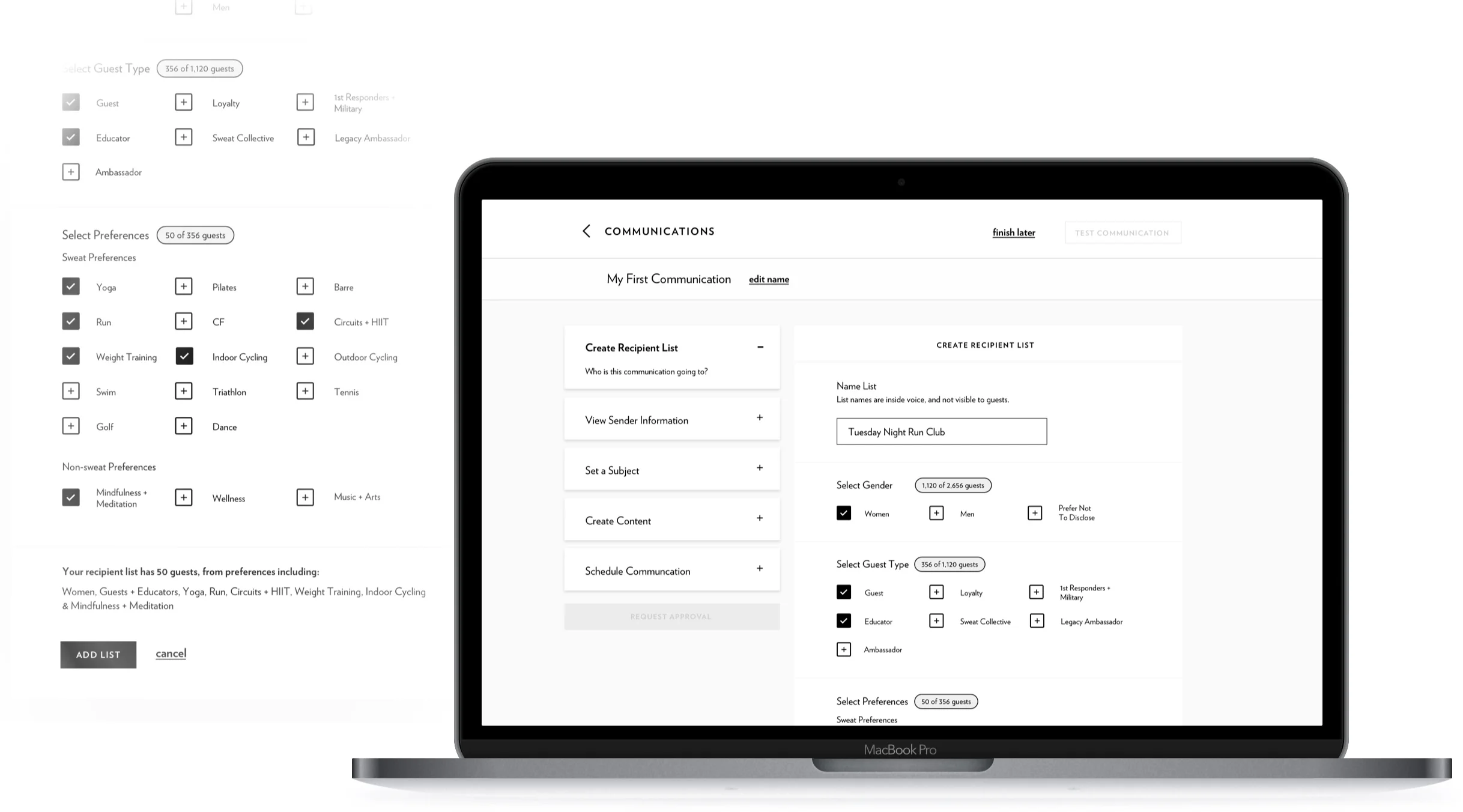
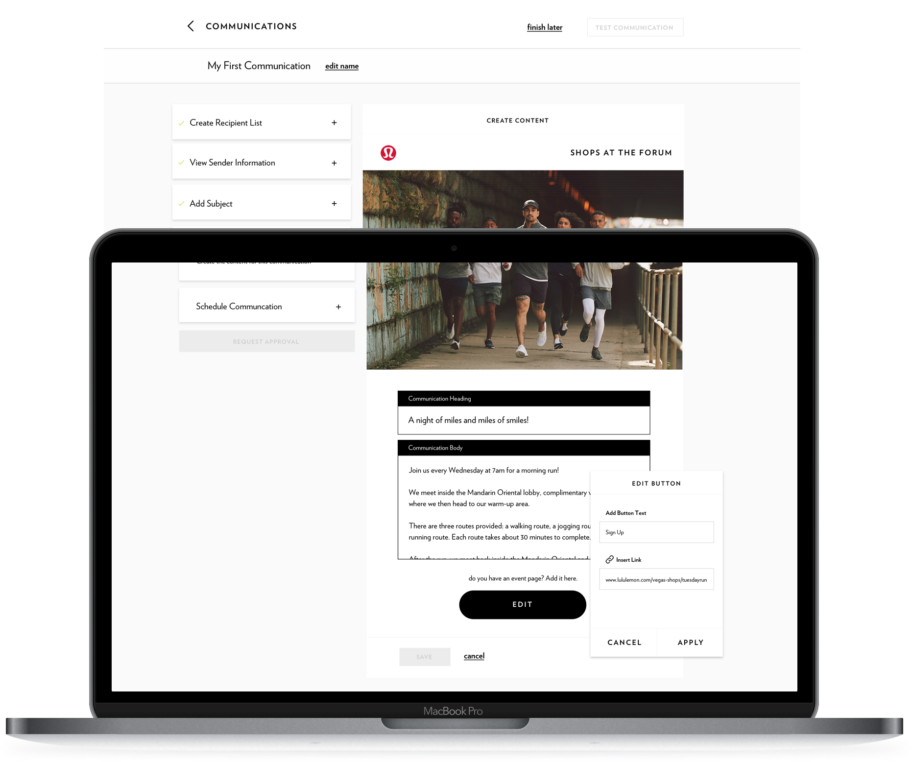
Front End Email Building
Once the educator was happy with their communication, they could work within an email creator to build the communication that is going to land in the inboxes of up to 17K guests at a time.
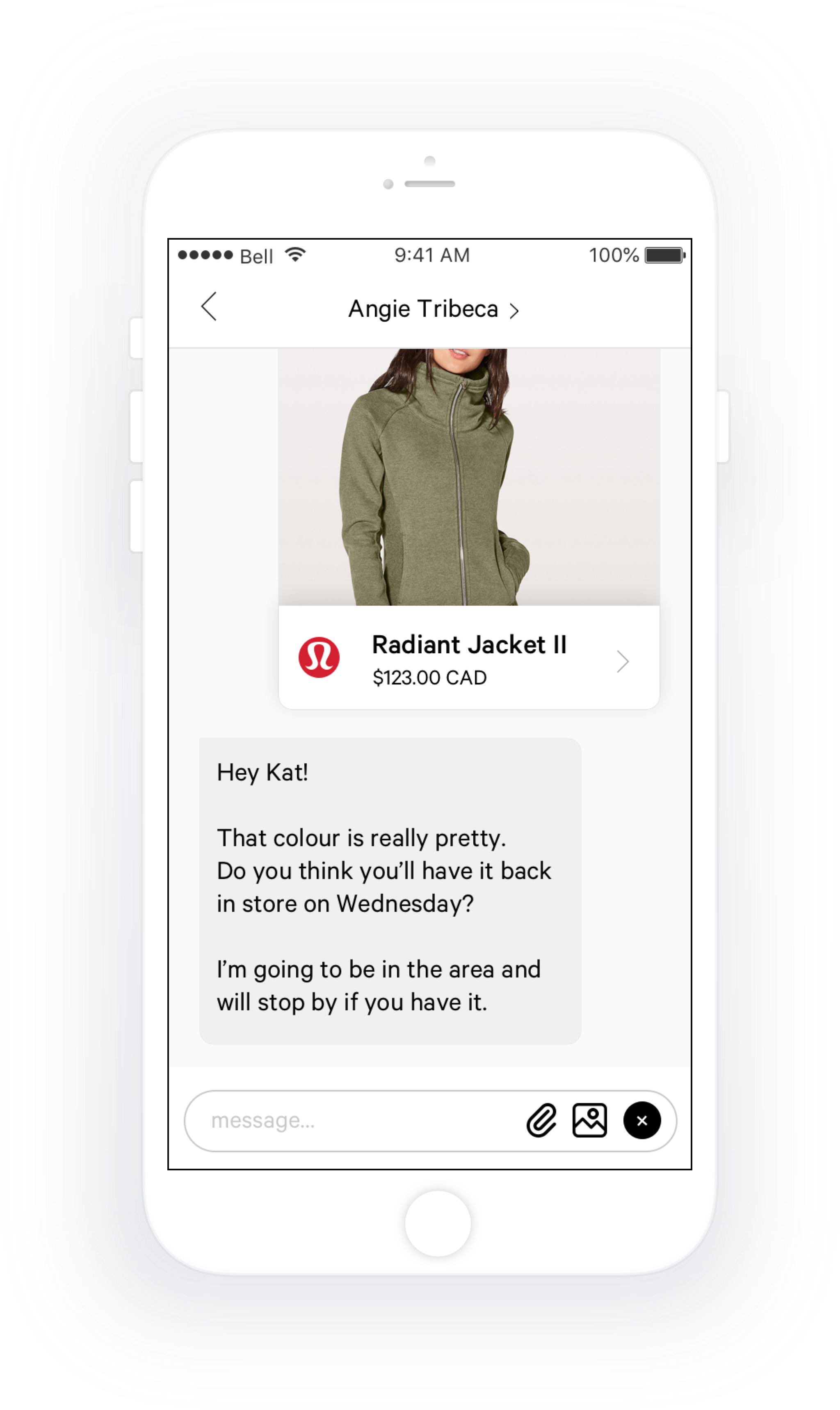
Little Black Book
A net-new product initiative linked to Local Outreach.
What is it? Customizing the guest experience in-store can be the difference between retaining and losing revenue. LBB is a in-store tool that gives our front line educators the ability to create and leverage robust guest profiles. This the first and only product across the business that has a 180 degree, omni-channel view on past purchase (and return) history.
Guest Profiles & Communication Centre
Educators can set communication preferences by type and store, along with connecting the guest to their sweat and non-sweat preferences. These preferences were key in building out our overall strategy for Local Outreach. Educators could directly connect and clientele, leveraging all the tools right at their fingertips


BackBackRoom
An existing product that had been led by out of house design agency. When I arrived, only 50% of educators across North America had ever transacted with it.
What is it? BBR, is a staple of the in-store ecosystem. Full in-store and online inventory visibility along with mobile point of sale transacting rounds out this into am essential tool that educators lean on to not only make plan each month but use so our guests never have to experience FOMO.
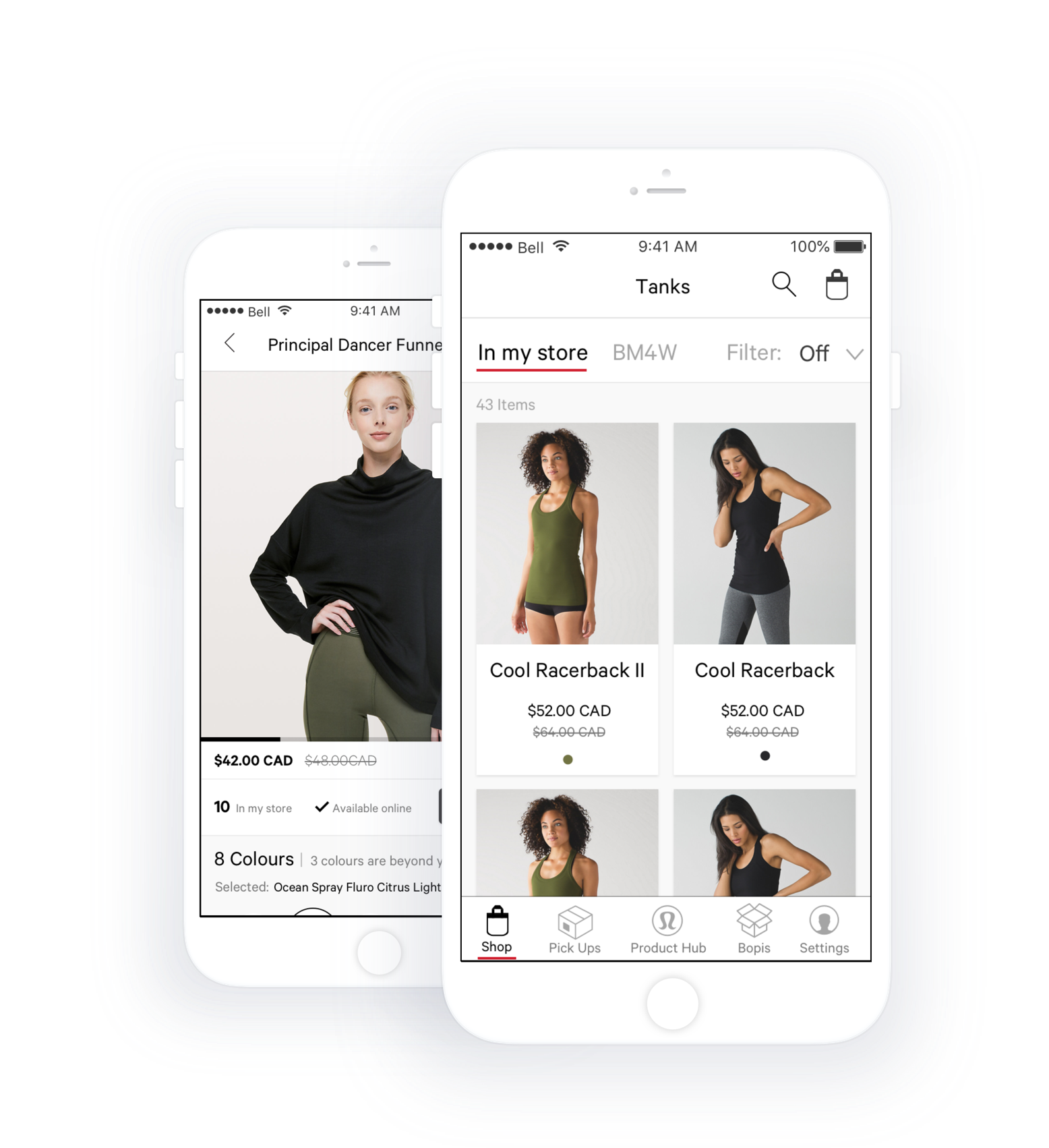
Better Visibility Into What’s Beyond My Four Walls
When I first started I spent about 50 hours in store listening and observing our educators on how they were using the current in-market version of the application. What I heard over and over again was how they felt their time wasn’t being valued.
Solutions:
Group important inventory information together.
Break out category products into what’s in store and whats beyond my four walls for better discovery and selling.
Move from a drawer navigational model to a more concise tab nav
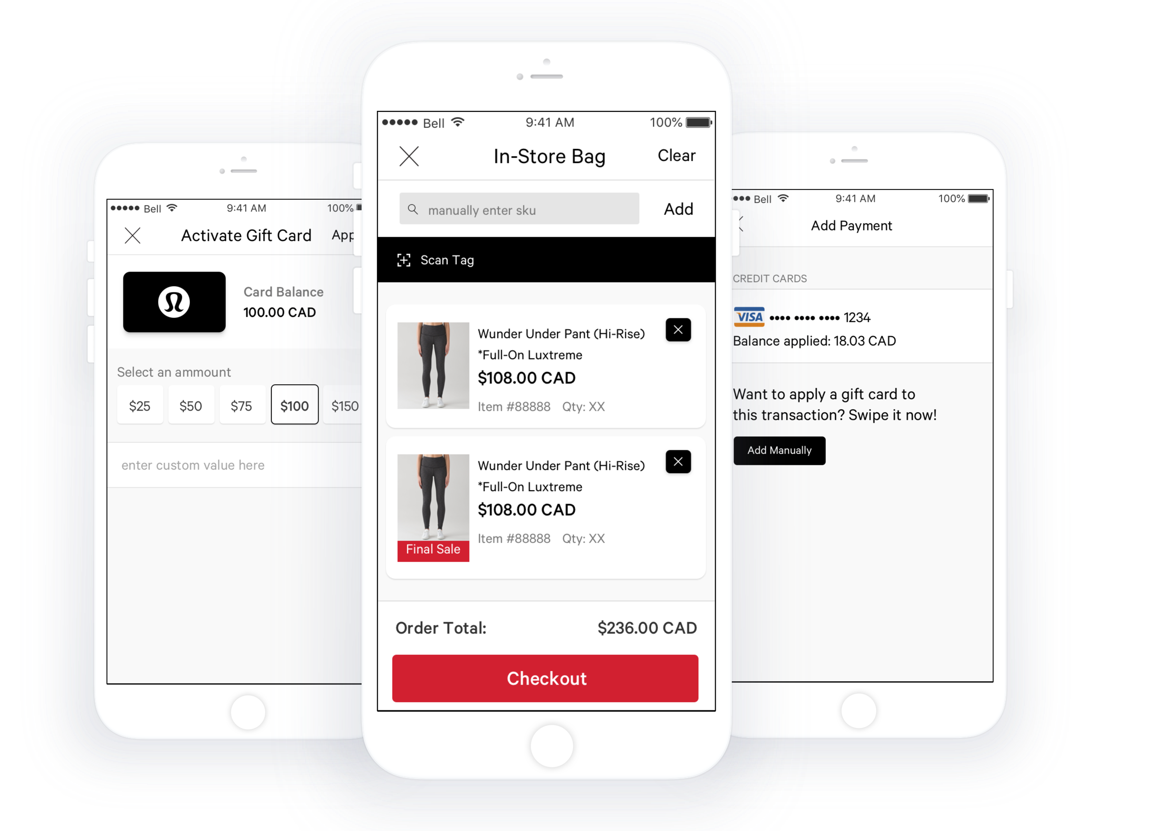
Mobile Point of Sale
A fully realized re-write of another stand alone app MiStore. In its new life, mPoS becomes a feature within BBR to enhance in-store experience. When our stores are in peak hours, wait times at cash can sometimes be a big deterrent. With mPoS, educators can bust lines, provide discounts on recently marked down goods and even sell and reload gift cards. We also partnered closely with our IMS partner to ensure we were decrementing the on floor inventory numbers in a meaningful way.

In-Store Digital (Mirrors and Fixtures)
When I was brought on, this program was out of house for both design and development. It suffered from unclear workflows and oftentimes ergonomically painful UI placement.
What is it? Interactive devices and mirrors in-store to educate on product, community events and sweaty pursuits.
Reimagined Idle State
Previously, the idle state was a product video with no interactive components. We were seeing our organic session engagement drop off which brought up a good challenge. Could we marry beautiful lifestyle centric imagery without overtly selling to the casual guest roaming the floor?
Solution:
A reimagining of the conventional image carousel. With images overlapping each other to create more of an editorial image layout.
Smart Merchandising via the branded content. Guests can tap into the anchors to view more about a specific piece within the image.
Focused side of screen idle state navigation, which mirrors main commerce site patterns.
Special, immersive gesture led category detail pages helped create magical moments between guest, device and product in special activations in store.

